Understanding color theory and its practical application in visual storytelling.
Introduction: The Invisible Language of Color in Film
Color grading represents far more than a mere technical post-production step—it stands as one of cinema’s most powerful emotional storytelling tools. Every frame of a film carries an invisible language written in hues, saturation levels, and temperature shifts that speak directly to the viewer’s subconscious mind. While audiences may not consciously recognize the meticulous color work happening on screen, they instinctively feel its profound impact on their emotional experience.
Filmmakers harness the psychological power of color to guide audience feelings with surgical precision, establishing tone before a single word of dialogue is spoken, and deepening narrative impact in ways that dialogue and performance alone cannot achieve. A warm golden glow can transform a simple conversation into an intimate memory, while a cold blue wash can inject tension into the most mundane scene. This manipulation of color creates an emotional roadmap that guides viewers through the filmmaker’s intended journey.
Emotional Guidance
Color palettes direct viewer feelings and create psychological associations that enhance narrative understanding
Tone Setting
Visual color schemes establish atmosphere and mood before characters or plot elements are introduced
Narrative Depth
Strategic color choices add layers of meaning and emotional resonance to cinematic storytelling
This comprehensive exploration delves into the fascinating intersection of color psychology and cinematic art, examining how deliberate color grading choices shape viewer emotions and transform the movie-watching experience. We’ll journey through the science behind our emotional responses to color, trace the historical evolution of color in cinema, and provide practical insights for filmmakers seeking to master this essential storytelling technique. By understanding the psychological mechanisms that make color such a potent narrative tool, we can appreciate the invisible artistry that makes great films unforgettable.
Understanding Color Psychology: The Science Behind Emotional Impact
The human brain’s response to color operates on both conscious and unconscious levels, triggering innate psychological and neurological reactions that evolved over millennia. Warm colors like red, orange, and yellow activate the sympathetic nervous system, increasing heart rate and creating feelings of energy, passion, or urgency. In contrast, cool colors such as blue, green, and violet engage the parasympathetic system, promoting relaxation, contemplation, or in some contexts, melancholy and detachment.
Psychologist Robert Plutchik’s influential wheel of emotions reveals fascinating parallels with color theory, demonstrating how specific hues align with fundamental human feelings. This connection isn’t arbitrary—it reflects deep-seated associations between environmental color cues and survival-related emotional responses. The red of blood signals danger; the blue of clear skies suggests safety; the green of vegetation promises sustenance and shelter.
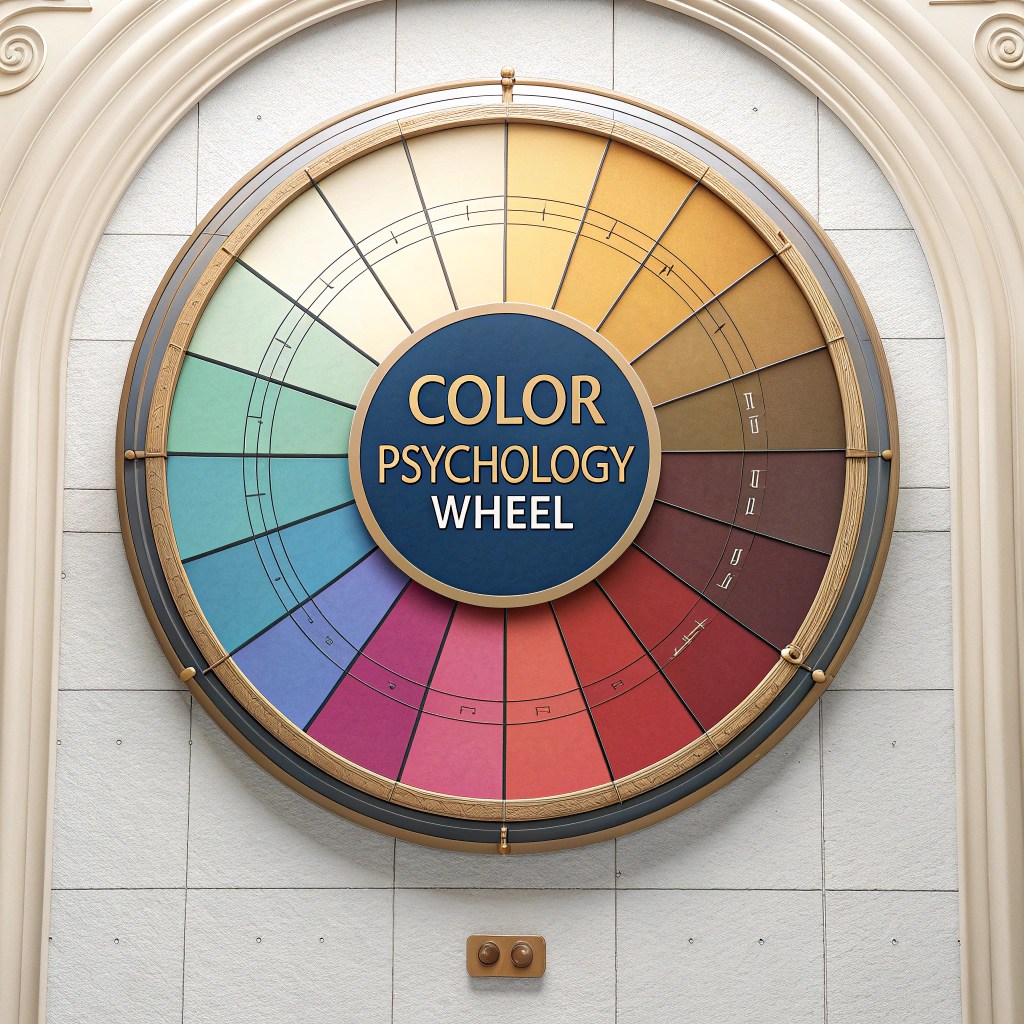
However, emotional responses to color exist along a spectrum of complexity. While certain reactions appear universal across cultures—red elevating arousal, blue inducing calm—individual experiences and cultural contexts create nuanced variations in color perception. A filmmaker must navigate both the universal language of color psychology and the cultural specificity of color symbolism to craft truly resonant visual narratives.
Red: Passion & Danger
Evokes intensity, love, anger, urgency, and heightened emotional states that demand immediate attention
Blue: Calm & Sadness
Creates feelings of tranquility, trust, isolation, or melancholy depending on context and saturation
Yellow: Joy & Anxiety
Stimulates optimism and happiness but can also trigger feelings of caution or unease when oversaturated
Green: Growth & Envy
Symbolizes nature, renewal, and harmony while also representing jealousy or sickness in certain contexts
The neurological basis for these responses involves complex interactions between the visual cortex, limbic system, and prefrontal cortex. When we perceive color, signals travel from the retina through the thalamus to multiple brain regions simultaneously, triggering both immediate emotional reactions and higher-level cognitive interpretations. This multifaceted processing explains why color can influence mood so profoundly while remaining largely beneath our conscious awareness—the perfect tool for cinematic manipulation.
Historical Evolution: From Black-and-White to Masterful Color Grading
The journey of color in cinema represents one of the most transformative technological and artistic evolutions in entertainment history. Early silent films, confined to monochrome imagery, demonstrated remarkable creativity within their limitations. Pioneering filmmakers hand-painted individual frames or applied chemical toning processes to entire sequences, laboriously adding color to create emotional emphasis or signal narrative shifts. These primitive techniques, while time-consuming and expensive, proved that filmmakers immediately recognized color’s storytelling potential.
1900s-1910s
Hand-coloring and tinting processes add selective color to black-and-white films through painstaking manual labor
1920s-1930s
Technicolor revolutionizes cinema with vibrant three-strip color processes, though high costs limit widespread adoption
1939-1950s
Landmark films like The Wizard of Oz use color symbolically, establishing color as narrative device beyond mere spectacle
1960s-1980s
Color becomes standard but controlled by photochemical processes with limited post-production flexibility
1990s-2000s
Digital intermediate processes and color grading software enable unprecedented control over final image appearance
2010s-Present
Advanced digital tools make sophisticated color grading accessible, elevating it to essential storytelling art form
The introduction of Technicolor in the 1920s and 1930s revolutionized cinema, though its prohibitive cost initially restricted color films to high-budget productions. The three-strip Technicolor process produced stunning, saturated hues that transformed movies into visual spectacles. However, the true watershed moment came with films that used color not merely for spectacle but as integral narrative device.
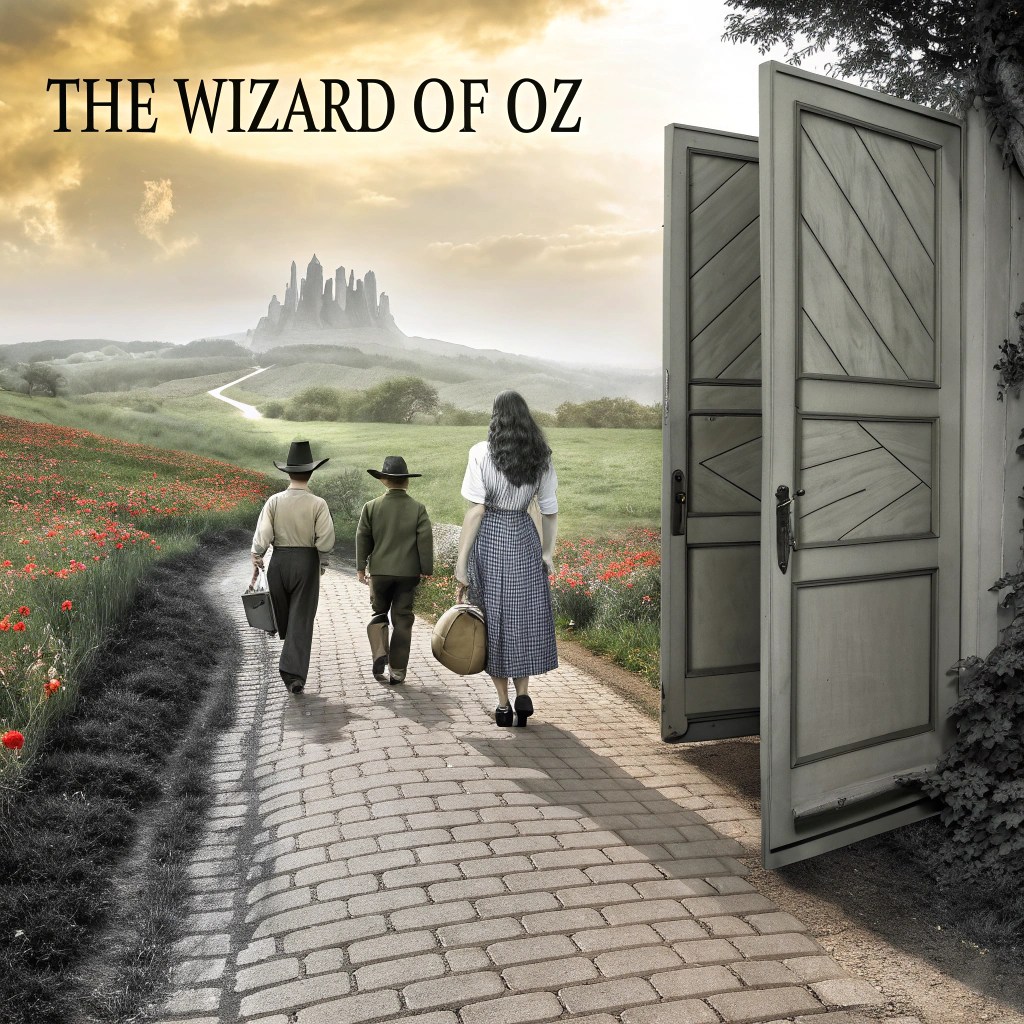
The Wizard of Oz (1939) remains the quintessential example of color as storytelling tool. The deliberate shift from sepia-toned Kansas to Technicolor Oz didn’t just wow audiences—it created an unforgettable visual metaphor for Dorothy’s journey from mundane reality to magical possibility. This single creative choice demonstrated that color could carry narrative weight equal to dialogue, performance, or editing.
The digital revolution of the late 20th and early 21st centuries democratized and elevated color grading from technical correction to genuine art form. Software like DaVinci Resolve, which began as a color correction system in the 1980s, evolved into sophisticated grading platforms offering frame-by-frame control over every aspect of color. Directors like Jean-Pierre Jeunet (Amélie) and Wes Anderson (The Grand Budapest Hotel) pushed these tools to create signature visual styles as distinctive as any director’s use of camera movement or editing rhythm. Today’s colorists possess godlike control over the emotional palette of cinema, manipulating hue, saturation, luminance, and contrast with precision that would astonish early filmmakers while fulfilling their wildest creative ambitions.
Key Components of Color Grading and Their Emotional Roles
Color grading encompasses multiple technical and creative dimensions, each contributing unique emotional qualities to the final image. Understanding these components allows filmmakers to construct sophisticated visual languages that resonate with audiences on intuitive levels. The interplay between these elements creates infinite possibilities for emotional manipulation and narrative expression.
Color Temperature
Perhaps the most immediately recognizable aspect of color grading, temperature shifts along the warm-to-cool spectrum create fundamental emotional contexts. Warm palettes dominated by oranges, yellows, and reds evoke comfort, nostalgia, intimacy, and passion—think golden hour cinematography or candlelit interiors that feel inviting and human. Cool palettes featuring blues, teals, and cyans suggest detachment, tension, sterility, or professionalism—the cold fluorescent lighting of hospitals or the blue-washed palette of dystopian futures.
The emotional power of temperature lies in its connection to our physical experiences of warmth and cold, safety and exposure, day and night. A scene can shift from threatening to comforting simply by warming its color temperature by a few hundred Kelvin.
Saturation and Brightness
Saturation controls color intensity, directly impacting emotional energy. Highly saturated colors create vibrant, energetic worlds that feel heightened and artificial—perfect for fantasy, musicals, or deliberately stylized narratives. These intense hues amplify emotions, making joy more ecstatic and danger more immediate. Conversely, desaturated or muted tones suggest melancholy, nostalgia, bleakness, or gritty realism. War films often employ desaturation to emphasize horror and futility, while period pieces use it to evoke vintage photography and distant memory.
Brightness similarly affects mood: high-key lighting with elevated brightness creates optimism and clarity, while low-key darkness breeds mystery, fear, or dramatic intensity. The combination of saturation and brightness defines a film’s overall emotional register.
Contrast and Color Harmony
Contrast ratios between light and dark areas create visual drama and guide viewer attention. High contrast produces striking, dramatic images with clear separation between elements, while low contrast yields softer, dreamier aesthetics. Color harmony—the relationships between hues within a frame—operates according to principles borrowed from painting and design.
Complementary colors (opposites on the color wheel, like orange and teal) create visual tension and dynamic energy that keeps eyes engaged. This explains the ubiquity of teal-and-orange grading in contemporary cinema—it simultaneously provides pleasing warmth in skin tones while offering cool contrasting backgrounds. Analogous colors (neighbors on the wheel) foster visual harmony and emotional coherence, creating unified moods that feel cohesive rather than chaotic.
The Teal and Orange Phenomenon: The popular teal-and-orange color grading scheme dominates modern cinema because it brilliantly balances complementary colors while flattering human skin tones (which sit in the orange range). This scheme creates visual interest through contrast while maintaining emotional accessibility—warmth in the subjects we care about, coolness in their environments. However, its overuse has sparked debates about homogenization in contemporary film aesthetics.
Color as a Narrative and Character Development Tool
The most sophisticated use of color grading transforms hues into narrative devices as important as dialogue or plot structure. Visionary filmmakers assign specific colors to characters, locations, or emotional states, creating visual leitmotifs that operate on subconscious levels. As stories progress and characters evolve, their associated colors shift accordingly, providing wordless commentary on psychological transformation.
This technique requires meticulous planning from pre-production through post. Production designers, costume designers, cinematographers, and colorists must collaborate to maintain color continuity and ensure that symbolic color choices read clearly without becoming heavy-handed. When executed brilliantly, color becomes a character in itself—a silent narrator guiding audience interpretation.
Case Study: Breaking Bad’s Color-Coded Morality
Vince Gilligan’s Breaking Bad provides a masterclass in using color to track character development. The series employs an intricate color system where characters’ wardrobes and environments reflect their moral states and narrative arcs. Walter White’s transformation from mild-mannered chemistry teacher to ruthless drug lord is charted through his color associations.
Early Seasons: Beige & Khaki
Walter wears neutral, unremarkable colors reflecting his passive, invisible existence and moral clarity
Transformation: Yellow & Green
As Walter enters the drug trade, yellows and greens dominate, suggesting contamination and moral compromise
Final Form: Black
Full Heisenberg mode sees Walter in black, signaling complete moral darkness and his embrace of criminality
Other characters receive similar treatment: Jesse Pinkman’s journey appears in reds and yellows, Skyler’s growing awareness of Walter’s crimes manifests in blues shifting to darker shades, and Marie’s purple obsession reflects her emotional denial. The show’s environments follow suit—the stark New Mexico desert appears in parched yellows suggesting moral wasteland, while the clinical blue of the meth lab emphasizes cold, destructive chemistry.
This color coding operates on multiple levels simultaneously. Viewers needn’t consciously recognize the patterns to feel their impact, yet attentive audiences discover layers of meaning upon rewatch. The technique foreshadows narrative developments—a character suddenly wearing unusual colors often signals impending transformation or danger. This symbolic use of color creates rich thematic resonance that elevates the series from crime drama to visual literature.
“Color is one of the most powerful tools in our storytelling arsenal. It speaks to the subconscious, creating emotional associations that viewers might not even realize they’re experiencing. When used with intention, it transforms simple scenes into complex emotional landscapes.”
Cultural Variations and Symbolism in Color Perception
While certain color associations appear universal—rooted in shared human biology and environmental experience—cultural context profoundly shapes color interpretation. Filmmakers creating work for global audiences must navigate these cultural variations carefully, as a color choice that resonates powerfully in one culture might completely misfire or even offend in another. The globalization of cinema demands cultural literacy in color symbolism.
White: Purity vs. Mourning
Western cultures associate white with weddings, innocence, and cleanliness. However, many East Asian cultures use white for funerals and mourning, creating dramatically different emotional resonances for the same hue. A bride in white signals celebration in Hollywood but grief in traditional Chinese cinema.
Red: Luck vs. Danger
Red signifies luck, prosperity, and celebration in Chinese culture, appearing prominently in festivals and weddings. Western traditions emphasize red’s associations with danger, passion, and violence. This divergence affects how audiences interpret red-dominated scenes—celebratory in one context, threatening in another.
Yellow: Caution vs. Royalty
Many Western contexts link yellow with caution and cowardice, while historical Chinese tradition reserved yellow for imperial royalty and sacred spaces. Indian culture associates yellow with knowledge and learning. These varying meanings require careful contextual framing.
Purple: Luxury vs. Death
Purple’s rarity in nature made it a color of wealth and power in Western history. However, some South American and Southeast Asian cultures associate purple with death and mourning, creating potential for cross-cultural miscommunication.
Religious and spiritual traditions further complicate color symbolism. Green holds sacred significance in Islam, blue carries divine associations in Christianity (particularly in depictions of the Virgin Mary), and orange represents spiritual enlightenment in Buddhism and Hinduism. Filmmakers must consider whether their target audiences will bring these associations to their viewing experience.
Strategies for Cross-Cultural Color Storytelling
- Research cultural color associations relevant to your story’s setting and intended audience demographics
- Use context and narrative framing to guide interpretation when employing culturally ambiguous colors
- Consider creating hybrid color languages that honor multiple cultural traditions simultaneously
- Test color choices with diverse focus groups to identify unintended cultural readings
- Embrace cultural specificity when telling culturally specific stories rather than defaulting to Western conventions
Some filmmakers deliberately leverage cultural color differences to create meaning for multicultural audiences. A film might present the same color differently to characters from different backgrounds, using subjective color grading to show how cultural perspective shapes perception itself. This sophisticated approach acknowledges that color meaning isn’t fixed but negotiated through cultural experience. Understanding cultural color symbolism enhances global audience connection and storytelling authenticity, transforming potential barriers into opportunities for deeper, more nuanced communication.
The Combined Impact of Color and Editing on Emotional Perception
Color grading never operates in isolation—it exists within the broader cinematic ecosystem of editing, sound design, performance, and narrative structure. Recent research in film studies and neuroscience reveals that color and editing techniques combine synergistically, creating emotional responses more powerful than either element alone. The rhythm of cuts, the duration of shots, and the pacing of sequences all modulate how viewers process and respond to color information.
Editing Pace
Rapid cutting intensifies color impact through repeated brief exposures, while long takes allow colors to gradually influence mood
Color Transitions
Cuts between contrasting color palettes create emotional punctuation, signaling shifts in tone or perspective
Duration Effects
Extended exposure to a color palette creates adaptation and normalization, making subsequent color shifts more impactful
Visual Contrast
Strategic placement of saturated colors against desaturated backgrounds directs attention and emotional focus
Iconic Cinematic Examples
Alfred Hitchcock’s Psycho (1960) demonstrates color and editing synergy despite being shot in black and white—the high-contrast cinematography combined with rapid cutting in the shower scene creates visceral terror through visual rhythm. Later in his career, Hitchcock used Technicolor in Vertigo (1958) and Marnie (1964), employing saturated reds during moments of psychological intensity, with editing pace accelerating as red dominates the frame.
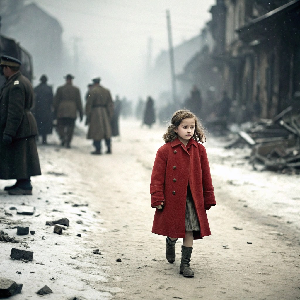
Steven Spielberg’s Schindler’s List (1993) provides perhaps cinema’s most famous example of selective color use. The predominantly black-and-white film features a single character—a young girl in a red coat—appearing in color during the Kraków ghetto liquidation. This choice, combined with specific editing decisions that track her movement through the chaos, transforms the girl into an unforgettable symbol of individual tragedy within mass atrocity. The red coat’s reappearance later in the film, combined with a long, static shot, delivers devastating emotional impact precisely because of the groundwork laid by the initial color-editing combination.
Neuroscientific Insights
Contemporary neuroscience research using fMRI technology reveals the brain mechanisms underlying these combined effects. Studies demonstrate that brighter, more saturated colors correlate with increased activation in brain regions associated with positive emotions (particularly the ventromedial prefrontal cortex), while darker, desaturated tones activate areas linked to negative affect and threat detection (such as the amygdala).
Crucially, editing pace modulates these responses. Rapid cutting between saturated colors creates heightened arousal states—the visual cortex processes color information while the brain’s temporal processing systems register quick changes, resulting in a compounded stimulation effect. This explains why action sequences often employ both fast editing and bold color contrasts to maximize excitement. Conversely, slow editing with gradual color transitions allows contemplative emotional states to develop, as viewers’ brains have time to fully process and emotionally respond to color information before the next visual stimulus arrives.
Research Spotlight: A 2019 study published in the journal Cognition and Emotion found that viewers showed 34% stronger emotional responses to film clips when color grading matched editing rhythm—warm, saturated colors with fast cuts for positive emotions, cool desaturated colors with slower cuts for negative emotions—compared to mismatched combinations. This suggests filmmakers can maximize emotional impact through intentional color-editing coordination.
Practical Tips for Applying Color Psychology in Film Production
Translating color psychology theory into effective practice requires both technical skill and artistic intuition. Whether you’re an aspiring filmmaker, professional colorist, or director seeking to expand your visual storytelling toolkit, these practical strategies will help you harness color’s emotional power systematically while preserving creative spontaneity.
Visualize Emotional Goals Before Grading
Before touching any color wheels, articulate the specific emotional journey you want audiences to experience. Create a written “emotional roadmap” for your film, identifying the intended feeling for each scene. This becomes your north star during grading sessions, preventing aimless experimentation and ensuring cohesive emotional architecture.
Trust Instinct Alongside Technical Skill
While scopes, waveforms, and vectorscopes provide valuable technical feedback, never let numbers override your emotional response to images. If something feels right emotionally but violates technical conventions, consider whether the emotional truth matters more. The best colorists balance analytical precision with intuitive artistry.
Choose Palettes Aligned with Genre Conventions
Study color palettes within your genre to understand audience expectations, then decide whether to meet, subvert, or transcend them. Romantic comedies typically employ warm, saturated palettes; sci-fi thrillers favor cool blues and teals; horror often uses desaturated, sickly greens. Knowing these conventions allows you to use them strategically or deliberately break them for impact.
Use Color Accents for Narrative Emphasis
Place strategic splashes of saturated color against more neutral backgrounds to direct viewer attention and highlight narrative elements. A red object in a blue-gray environment becomes impossible to ignore—use this selective saturation to emphasize important props, characters, or thematic symbols.
Experiment with Temperature and Saturation
Create multiple grade versions of key scenes, varying temperature and saturation systematically. Export them and compare how different approaches affect the scene’s emotional resonance. Sometimes the difference between good and great is 200 Kelvin or 10% saturation—experimentation reveals these nuances.
Collaborate Closely with Production Teams
Color grading works best when integrated with production design, costume design, lighting, and cinematography from pre-production forward. Share color palette references with all visual departments to ensure cohesive planning. A colorist can’t create red dominance if production design avoids red entirely.
Building Your Color Grading Workflow
Pre-Production Phase
- Create color mood boards and reference stills from films with desired aesthetic qualities
- Develop color scripts—shot-by-shot color planning documents that map emotional beats
- Test grade looks on production tests to ensure feasibility with chosen cameras and lighting setups
- Establish LUT (Look-Up Table) workflows for on-set monitoring that approximate final grade intentions
Post-Production Phase
- Begin with broad strokes—establish overall palette before finessing individual shots
- Grade in context by watching entire scenes rather than obsessing over individual frames
- Take breaks to reset your eyes and prevent perceptual drift from extended screen exposure
- Test grades on different displays and in various viewing conditions to ensure consistency
“The best color grade is the one you don’t notice—it simply feels right. You’re not consciously thinking about the colors, but they’re guiding your emotions throughout the entire viewing experience. That invisible influence is the colorist’s ultimate achievement.”
Remember that color grading exists on a spectrum from invisible correction to bold stylization. Neither approach is inherently superior—your project’s needs should dictate where you land on this spectrum. Documentary work might demand naturalistic grading that preserves authenticity, while music videos or fantasy films might embrace hyper-saturated, impossible colors that announce their artifice. The key is intentionality—every color choice should serve your story’s emotional and thematic goals.
Conclusion: Harnessing the Power of Color to Transform Film Experiences
Color grading has evolved from technical necessity to essential storytelling language, fundamentally shaping how audiences experience and interpret cinematic narratives. As we’ve explored throughout this comprehensive examination, color operates as a silent but powerful emotional conductor, orchestrating viewer feelings with precision that dialogue and performance alone cannot achieve. Every hue, saturation level, and temperature shift carries psychological weight, speaking directly to the subconscious mind and creating emotional contexts that define our relationship with on-screen stories.
The mastery of color psychology elevates filmmaking from mere entertainment to immersive art, creating emotionally rich narratives that resonate long after the credits roll. Directors and colorists who understand color’s emotional vocabulary possess a transformative tool—one that can turn ordinary scenes into unforgettable moments, guide audiences through complex emotional journeys, and imbue visual storytelling with layers of meaning that transcend language and culture.
Emotional Impact
Percentage of viewers who report stronger emotional responses to films with deliberate color grading versus neutral correction
Memory Retention
Viewers remember scenes with distinctive color palettes 2.5 times better than scenes with neutral grading after one week
Professional Adoption
Professional filmmakers now cite color grading as one of their top three priorities in post-production workflow
As technology continues to advance, filmmakers possess unprecedented tools to craft nuanced emotional journeys through color. Modern color grading software offers capabilities that would have seemed like science fiction to earlier generations of filmmakers—real-time grading, AI-assisted color matching, HDR workflows that expand dynamic range beyond previous limits, and remote collaboration tools that enable colorists worldwide to work together seamlessly. These technological innovations don’t diminish the artistic craft; rather, they amplify creative possibilities and democratize access to sophisticated color storytelling.

Yet with these powerful tools comes responsibility. The same techniques that create emotionally resonant cinema can manipulate viewers in ethically questionable ways. Understanding color psychology means recognizing its persuasive power and wielding it thoughtfully, respecting audience intelligence while guiding emotional experience. The best color work enhances and clarifies a story’s inherent emotional truth rather than imposing artificial feelings contrary to narrative intent.
Embrace Color as Character
Treat color as a dynamic character in your storytelling toolkit, with its own arc, motivations, and emotional presence
Study Continuously
Analyze color work in films across genres and eras, building visual literacy in how master colorists craft emotional experiences
Experiment Fearlessly
Push boundaries and take creative risks with color—innovation comes from those willing to challenge conventions
Collaborate Generously
Share knowledge and work closely with creative teams to create unified visions greater than any individual contribution
For aspiring filmmakers, the journey toward color mastery begins with observation and experimentation. Watch films with the sound off to isolate visual storytelling. Create color studies of favorite films, analyzing how palettes shift across narrative arcs. Practice grading with intention, articulating the emotional goal of each choice. Most importantly, trust that developing color intuition takes time—it’s a skill honed through years of practice, failure, and gradual refinement.
The future of color grading promises even more exciting possibilities. Virtual reality and immersive media present new challenges and opportunities for color psychology, as 360-degree environments require rethinking traditional color composition principles. AI and machine learning tools may soon assist colorists in achieving specific emotional targets, analyzing footage to suggest grades that match intended emotional profiles. Yet regardless of technological evolution, the fundamental truth remains unchanged: color moves us because we are human, and humans have always responded to the emotional language of light and hue.
Embrace color as your ally in the noble pursuit of moving audiences, telling truths, and creating beauty. Let it guide you toward deeper emotional authenticity in your work. Whether you’re crafting intimate character studies or epic visual spectacles, color grading offers infinite possibilities for touching hearts and changing minds. The palette awaits—paint your stories with intention, courage, and the profound understanding that color is not merely decoration but the very essence of cinematic emotion. The screen is your canvas, and every hue is a brushstroke in the masterpiece you’re creating.
Connect and Explore Further
Join the conversation about color grading and film psychology across social media platforms. These hashtags will help you discover communities of filmmakers, colorists, and cinema enthusiasts exploring the emotional power of color in visual storytelling:
#ColorGrading
#FilmPsychology
#ColorTheory
#CinematicColor
#EmotionalStorytelling
#FilmProduction
#VisualStorytelling
#ColorInFilm
#MovieMaking
#FilmEditing
Share your own color grading experiments, favorite examples of color psychology in cinema, or insights from your filmmaking journey using these tags. The filmmaking community thrives on shared knowledge and mutual inspiration—your perspective might be exactly what another creator needs to break through to their next level. Whether you’re a seasoned professional or just beginning to explore the emotional power of color, there’s a place for you in this ongoing conversation about the art and science of visual storytelling.
“Film is emotion in motion, and color is the emotion’s voice. Every project teaches us something new about how light, hue, and human psychology intersect to create unforgettable experiences. Keep learning, keep experimenting, and keep telling stories that matter.”

Leave a comment